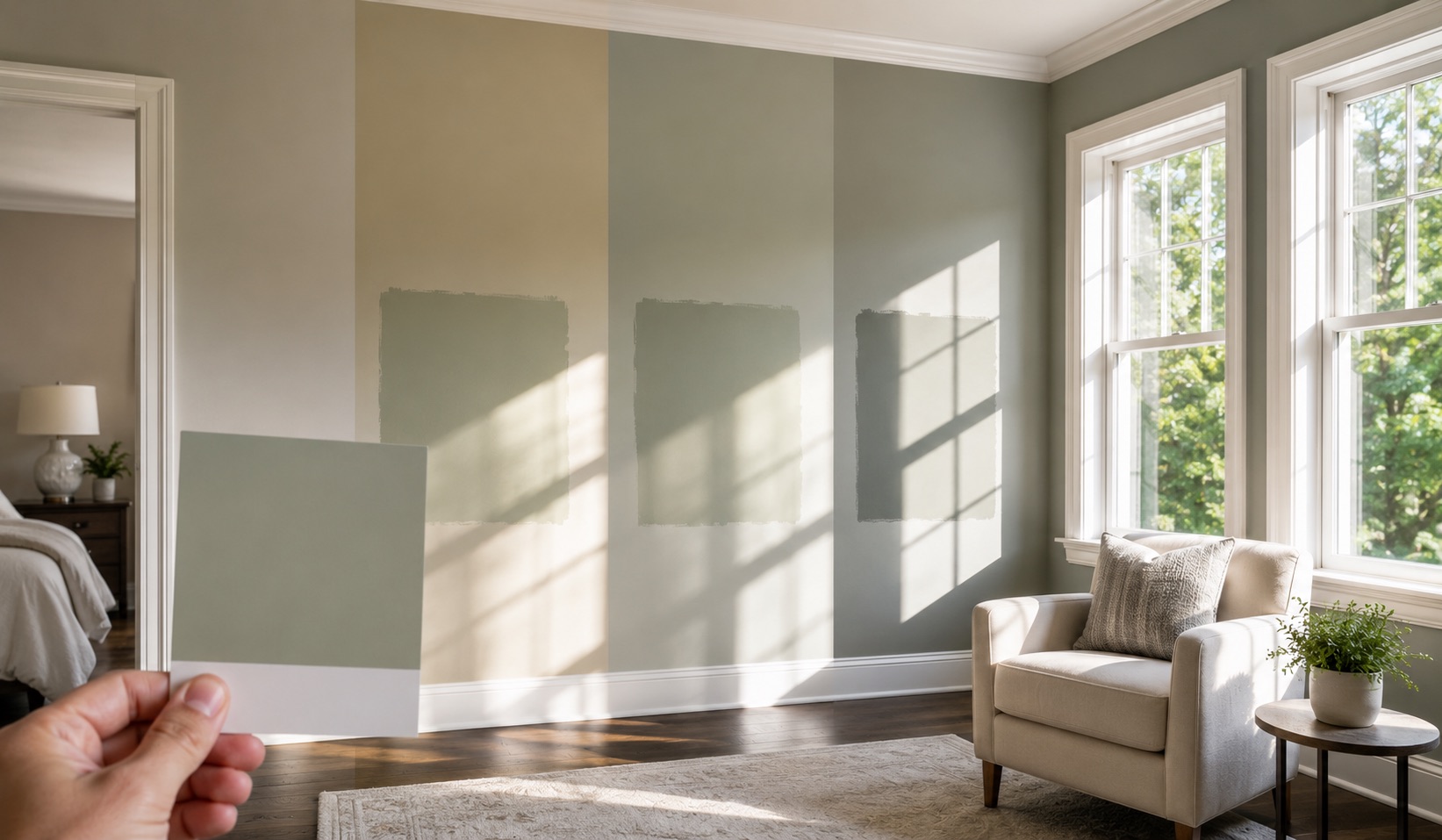
The most common color complaint we get is not about the color we applied. It is that the color on the wall does not look like the chip the homeowner picked at the store. The paint matched the chip exactly. The room changed how it looks.
This is one of the most predictable conversations in residential painting, and after 2,100 estimates across Middle Tennessee since 2015, we head it off before the gallon is bought rather than explain it after the wall is painted. The chip is not lying on purpose; it is just showing you the color under conditions that have nothing to do with your room. The sections below explain why the chip rarely matches the wall, what south-facing light specifically does to color, the undertone problem nobody warns you about, and how we sample color so the wall looks the way you expected.
The Chip Lies, and Here Is Why
A paint chip lies because it is two inches of color under a store’s fluorescent light, and your wall is a hundred square feet under your room’s natural light. Those are two completely different viewing conditions, and color does not survive the trip between them unchanged.
Three things shift the color between the chip and the wall:
This is why we tell homeowners not to commit to a color off the chip alone. The chip is a starting point for the conversation, not the decision. The decision happens on the wall, in the room, in the light the room actually gets.
What South-Facing Light Does to Color
South-facing rooms get warm, golden light all day, and that warmth pushes every color on the wall toward its warmer side. A south window pulls sun from sunrise to sunset, and that light carries an amber cast that lands on everything in the room, including the paint.
The practical effect is that a color reads warmer on a south wall than it did on the chip. A gray you picked for its cool, modern feel can read beige or even slightly yellow once the south light hits it. A white can lose its crispness and turn creamy. The color did not change; the light is adding warmth the store fluorescent did not.
This cuts two ways depending on what the homeowner wants. If the goal is a warm, cozy room, south light amplifies it, and a warm color becomes glowing. If the goal is a cool, crisp, modern room, south light fights it, and the standard advice from manufacturers like Benjamin Moore is to counterbalance the amber with a paint that carries a hint of gray or blue. We steer south-facing rooms slightly cooler than the homeowner’s target, because the room will warm the color back up on its own.
Every Direction Changes the Color Differently
The direction your windows face changes the color more than homeowners expect, and south is only one of four stories. When we walk a house, the orientation of each room is part of the color conversation before we get to specific shades.
| Direction | Light Quality | Effect on Color |
|---|---|---|
| South | Warm, golden, bright all day | Pushes colors warmer, can wash out very light shades |
| North | Cool, flat, gray, consistent | Pushes colors cooler, can make grays feel icy |
| East | Warm in morning, cool by afternoon | Color shifts through the day, warmest at breakfast |
| West | Neutral morning, intense golden at dusk | Color glows hot in late afternoon, flat earlier |
A color that works beautifully in a south-facing living room can look cold and gray in a north-facing bedroom down the hall. This is why we do not pick one color for a whole house without checking it against each room’s exposure, especially when rooms with different orientations connect along a sightline.
The compass test is simple: stand in the room and point your phone’s compass at the largest window. Whichever direction it reads is the light story you are working with.
The Undertone Hiding in Your Neutral
Every neutral has an undertone hiding under it, and south light is what drags that undertone into the open. The grays, greiges, and whites that look so safe on the chip all lean somewhere: toward green, blue, purple, pink, or yellow. In flat store light, you cannot see it. In a room flooded with directional natural light, the undertone shows up on the wall.
That hidden lean is the source of the “it looks nothing like I expected” reactions. A greige that looked like a clean warm neutral on the chip turns out to have a green undertone that the south light pulls forward, and suddenly the room reads slightly sage instead of soft taupe. The homeowner did not pick wrong; the undertone was there all along, waiting for the light to reveal it.
How we work the undertone problem:
The undertone is invisible until it is on the wall in the room’s light, which is exactly why the sample has to happen there.
Why We Sample on Your Actual Wall
We sample colors on the actual wall, in the actual room, at the actual times of day the room gets used. A sample painted in the room tells the truth that the chip cannot, because it is the full color, at scale, under the room’s own light, next to the furniture that lives there.
How we sample for a south-facing room:
The reason this matters is that repainting a room because the color read wrong is the most avoidable cost in a project. An hour with a sample on the wall saves a full repaint, which is why we build the sample step into the plan rather than treating it as optional. Our ten to fifteen painters across five teams carry sample pots to the walkthrough so a homeowner can see candidate colors going up the same day we measure the room. On any interior repaint job, the sample is cheap insurance against the expensive mistake of a color that only looked right in the store.
Want us to sample your color on the wall before you commit to it? Call 615-987-8011 and we will paint a swatch in the room and look at it together across the day.
Sheen Changes Everything in Bright Light
Sheen changes how south light reads on a wall as much as color does. A glossy or satin finish reflects the strong south light back into the room, creating glare and amplifying every surface imperfection the bright light already exaggerates. A matte or eggshell finish absorbs more of that light and reads softer.
In a south-facing room flooded with light, we usually steer toward lower sheens on the walls. A flat or matte finish tames the glare and lets the color read as color rather than as a reflective surface. The bright light that makes a south room feel alive is the same light that turns a high-gloss wall into a mirror, so the sheen decision matters more in these rooms than in a darker north-facing space.
The exception is trim and high-touch surfaces, where durability and cleanability argue for a higher sheen. We balance the two by keeping walls low-sheen to manage the light and reserving the higher sheen for trim, where the smaller surface area limits the glare and the durability earns its place. The same sheen-versus-light tradeoff shows up on an exterior paint job in direct sun, where direct sun on a south or west wall makes a high-sheen finish read like a mirror in the late afternoon.
The Color Plan We Write
The color plan we write includes the on-wall sample step before the order goes in, so the homeowner sees the color in the room and signs off on it before a single gallon is mixed. The plan reads:
Color plan: Candidate colors sampled on actual walls, minimum two-foot swatches, on multiple walls per room. Samples reviewed across morning, midday, and evening light. Undertones matched across connected rooms along sightlines. Sheen selected per room exposure, lower sheen for high-light rooms. Final color confirmed with homeowner on the wall before product order.
The plan comes out of a walkthrough where we note each room’s orientation, the existing flooring and trim colors, and the times of day the room gets used most. That information shapes which colors we sample and which sheen we recommend.
Across the homes we paint around Middle Tennessee, the on-wall sample step is standard on any color the homeowner is unsure about, because the chip-to-wall surprise is the one color problem that is fully preventable. Reach our residential painting team to walk through your rooms and their light.
Bottom Line
A south-facing room makes a color read warmer than the chip promised, pulls hidden undertones into the open, and reflects bright light in a way that changes how both color and sheen behave. None of that is a reason to fear color in a sunny room; it is a reason to sample on the wall instead of trusting the chip.
We are AllBright Pro Painting in Smyrna, operating under TN license #1001565828. Bring us the room and we will sample the color in its own light before a single gallon is bought. Reach the AllBright painting team or call 615-987-8011 to set up a color walkthrough.