

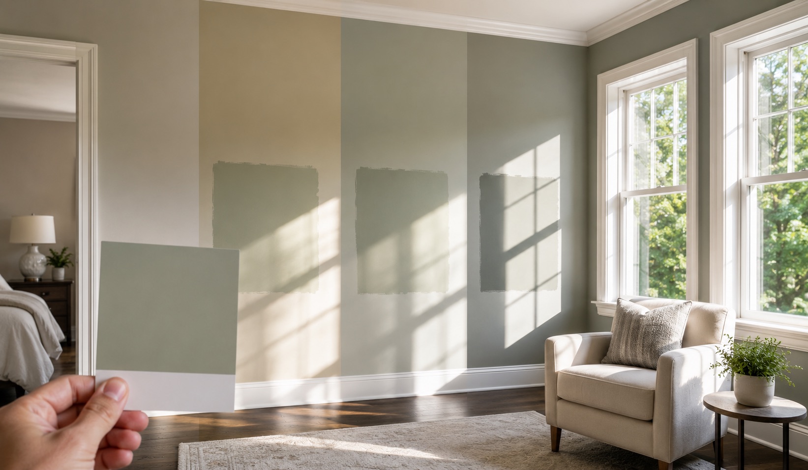
The most common color complaint AllBright Pro Painting hears is not that the wrong paint went on the wall. It is that the right paint looks wrong once it gets there.
The formula on the label can match the selected color. The room can still make that color appear warmer, cooler, lighter, duller, or more saturated than the small chip suggested.
That is not a defect in the paint, and it is not proof that the homeowner chose badly. A chip records one color under one set of viewing conditions. Your room supplies an entirely different set.
A south-facing window is part of the explanation, but compass direction is not the whole diagnosis. Window size, overhangs, trees, glass tint, wall position, flooring, furniture, trim, bulbs, and time of day all participate. The room, not the chip, makes the final decision.
The Chip Is a Reference, Not a Preview
A paint chip is useful for comparing one candidate with another. It is poor at predicting a finished room because the test conditions are too different.
Three changes happen between the display rack and your wall:
- Scale changes the experience. A restrained color on a small card can feel much stronger across four full walls.
- Light changes the reading. Store lighting, daylight, lamps, and recessed fixtures can emphasize different parts of the same color.
- Surroundings change the comparison. Flooring, trim, countertops, upholstery, and adjacent rooms give the eye new reference points.
Even a perfect color match cannot make those conditions identical. The chip is a starting point for the conversation, not the decision.
This is why AllBright Pro Painting tries to resolve uncertainty during project planning. Explaining a surprising color after an entire room is finished is a poor substitute for testing it before the product order is final.
What South-Facing Light Can Do
In Middle Tennessee, an unobstructed south-facing room often receives substantial daylight across the day. That light may make warm elements in a color easier to notice. A gray can begin to read greige. A white can feel creamier. A warm neutral can become more dominant than it appeared under store lighting.
But “south-facing” does not guarantee a golden room from morning to evening. A deep porch can block direct sun. Trees can filter it. Small windows can limit it. Tinted glass can alter it. A wall opposite the window does not receive light in the same way as a return wall beside it.
The useful conclusion is therefore narrower than the familiar internet rule. South-facing exposure tells us where to begin observing. It does not prescribe a cool color, a gray undertone, or a particular white.
If a homeowner wants a warm, enveloping room, the light may support that direction. If the goal is cleaner or quieter, a slightly cooler candidate may be worth testing. “Worth testing” is the operative phrase. A cooler swatch can solve one room and turn lifeless beside a cool floor or under cool lamps.
AllBright Pro Painting does not correct a compass direction with a formula. We compare candidates in the room that will receive them.
Window Direction Is Only One Part of the Light Map
Room orientation helps explain when and how natural light enters, but the descriptions below are tendencies, not color guarantees.
| Largest-window direction | Common daylight pattern | What to watch during sampling |
|---|---|---|
| South | Longer periods of strong daylight when the window is unobstructed | Warmth becoming stronger, pale colors losing definition, glare on reflective finishes |
| North | More indirect and comparatively even daylight | Cool undertones becoming more apparent, muted colors feeling flatter |
| East | Brighter and often warmer earlier in the day | A color that feels lively at breakfast becoming quieter later |
| West | Stronger light later in the day | Warmth, glare, and saturation becoming more pronounced near evening |
To identify the starting orientation, stand inside the room and point a phone compass toward the largest window. Then add the facts the compass cannot see:
- Is the window shaded by a porch, tree, or neighboring house?
- How large is the glass compared with the room?
- Which walls receive direct light, reflected light, or mostly lamp light?
- When is the room actually used?
- Do its doors remain open to another room with different exposure?
That quick map is more useful than selecting a “best south-facing color” from a generic list.
Undertone Is a Relationship, Not a Hidden Label
Whites, grays, greiges, and beiges are not visually neutral in every setting. Place two near-neutrals beside each other and one may look greener, pinker, bluer, more violet, or more yellow than the other.
The surrounding room helps reveal that relationship. Warm wood flooring can make a gray look cooler by comparison. A creamy trim can make a clean white wall feel stark. A green view through large windows may change how a neutral is perceived near the glass. Artificial light can shift the balance again after sunset.
The homeowner did not pick wrong. The undertone was there all along, waiting for the room to reveal it.
This is why undertones should be compared, not named in isolation. Put the candidate beside the elements that will remain after painting:
- Fixed flooring and tile
- Cabinetry and countertops
- Trim and ceiling colors
- Large furnishings
- Stone or brick
- Paint in a connected room
A neutral only has to work with the home it will live in. It does not have to win an abstract color-theory test.
Connected Rooms Need a Sightline Test
A color can work inside one room and still create a problem from the hallway. Open doors, arches, stair landings, and open-plan layouts allow several painted surfaces to appear in one frame.
When those rooms face different directions, the same color may not appear identical across the sightline. Using one formula everywhere can still produce visible variation. Using different colors can work, but the undertones and contrast need to look intentional from the places where both are seen together.
Stand in the entry, main hallway, kitchen, and usual seating position. Photograph the connected surfaces in one frame. If two candidates look unrelated there, evaluating them one room at a time will not repair the transition.
This is distinct from choosing a broadly appealing color before a home sale. The question here is not which color might attract a buyer. It is how the selected color behaves in this home’s actual light.
Test the Color Without Creating a False Result
A useful sample needs enough area and enough contexts to expose change. One small dab beside the window can be as misleading as the store chip.
Use this protocol before approving a color:
- Shortlist before sampling. Compare candidates with the fixed finishes and remove obvious undertone conflicts.
- Create a large field of color. Use a movable sample board or a properly prepared wall sample large enough to judge from across the room.
- Move or repeat the sample. Check the wall facing the window, a side wall, and the darkest relevant area.
- View it when the room matters. Morning, midday, evening, and nighttime lamp light can produce different readings.
- Check both bright and overcast conditions when the schedule allows. A color that works only in strong sun may feel very different on a dim day.
- Step into adjacent spaces. Judge the candidate through the same doorways and sightlines used in daily life.
- Record the exact selection. Manufacturer, color name, color number, and sheen should be confirmed together before ordering.
If sampling directly on a wall, account for the existing wall color and the sample product being used. A small or thin patch over a strong background can distort the comparison. A movable board avoids building several test patches into a wall that may require additional preparation later, although its position and angle still need to match the wall being evaluated.
The objective is not to find a color that looks identical at every hour. No room behaves that way. The objective is to approve the range of appearances the homeowner will actually live with.
Digital Visualization Can Narrow the Field, Not Approve the Paint
AllBright Pro Painting offers digital render visualizations during interior project planning. They can help compare broad directions, such as lighter versus darker walls, a contrasting accent, or a change in trim color.
A rendering cannot reproduce the exact daylight, screen calibration, paint film, surface texture, or sheen of the finished room. It is a selection aid, not color proof.
Use a visualization to reduce a large set of possibilities. Use a physical sample in the actual room to approve the finalist. Confusing those two jobs creates false confidence with very tidy graphics, which is still false confidence.
The interior house painting service page explains the broader consultation, surface, product, and project process. This article owns the narrower decision: how to keep room light from turning an appealing chip into an avoidable surprise.
Sheen Changes the Light, Not Just the Cleanability
Color and sheen cannot be approved as separate decisions. A more reflective finish can make bright areas more active, reveal surface irregularities, and create highlights that interrupt the apparent color. A lower-sheen finish can look quieter, but it may not meet the cleaning or durability needs of every room.
That is why “use matte in a south-facing room” is no better as a universal rule than “use a cool color.” The decision also depends on:
- The condition and texture of the wall
- The amount and angle of daylight
- Nighttime lighting
- Expected contact and cleaning
- The selected product’s available sheen levels
- The sheen already used on trim, doors, and nearby surfaces
Trim may intentionally carry more sheen than walls. A high-contact room may justify a different balance than a formal room. The correct choice is the one that manages both appearance and use in the specified space.
For the final sample, use the intended sheen whenever practical. Approving a flat sample and ordering a more reflective finish introduces another variable after the decision was supposedly complete.
Put the Color Decision in the Project Record
A color plan does not need ceremonial contract language. It needs an unambiguous record before materials are ordered.
For each included surface, record:
- Room or area name
- Wall, ceiling, trim, door, or accent designation
- Manufacturer, color name, and color number
- Product and sheen
- Which sample or visualization was reviewed
- Who approved the selection and when
- Any connected rooms that were evaluated along the same sightline
If the homeowner changes a confirmed selection, the effect on materials, schedule, and price should be discussed and documented before the change is carried out. A hallway conversation should not become a surprise color order.
The written record protects both appearance and scope. It prevents two whites with similar names from being exchanged, keeps trim sheen from being assumed, and gives the final walkthrough an agreed reference.
What AllBright Pro Painting Checks During Color Planning
Before color is finalized, the useful conversation is specific to the home:
- Which rooms receive the most natural light?
- When are those rooms occupied?
- Which fixed finishes will remain?
- Where do different exposures meet along a sightline?
- Does the existing wall condition make a reflective sheen risky?
- Is the homeowner trying to create warmth, reduce it, or preserve balance?
- Which decisions can be explored digitally, and which require a physical sample?
The goal is not to choose for the homeowner. It is to make the decision under conditions that resemble the finished room closely enough to expose a bad fit before it becomes a full repaint.
The chip-to-wall surprise is among the most preventable color problems. Sampling reduces that risk; it does not abolish changes in season, furnishings, bulbs, or daylight. The plan should be honest about both its value and its limit.
The Bottom Line
South-facing rooms often make warm elements more noticeable, but window direction alone does not select the paint. The color will be judged beside your flooring and trim, across connected rooms, under changing daylight, and under the lamps used after sunset.
Start with the chip. Map the room’s actual light. Compare undertones against the fixed finishes. Review a large sample in more than one position and at the times that matter. Approve the color and sheen together, then record the exact selection.
AllBright Pro Painting helps homeowners make that decision before an interior project begins. To review the rooms, sightlines, colors, and sheen choices in your Nashville or Middle Tennessee home, schedule an interior painting estimate or call 615-987-8011. The purpose of the walkthrough is not to make every color look unchanged. It is to make sure the changes are ones you have already seen and accepted.